Your comments
If you want more users, then I suggest perhaps improving the UI will attract a lot more people than adding more features; the extension already has a ton of features. Here are my additions to the UI thread:
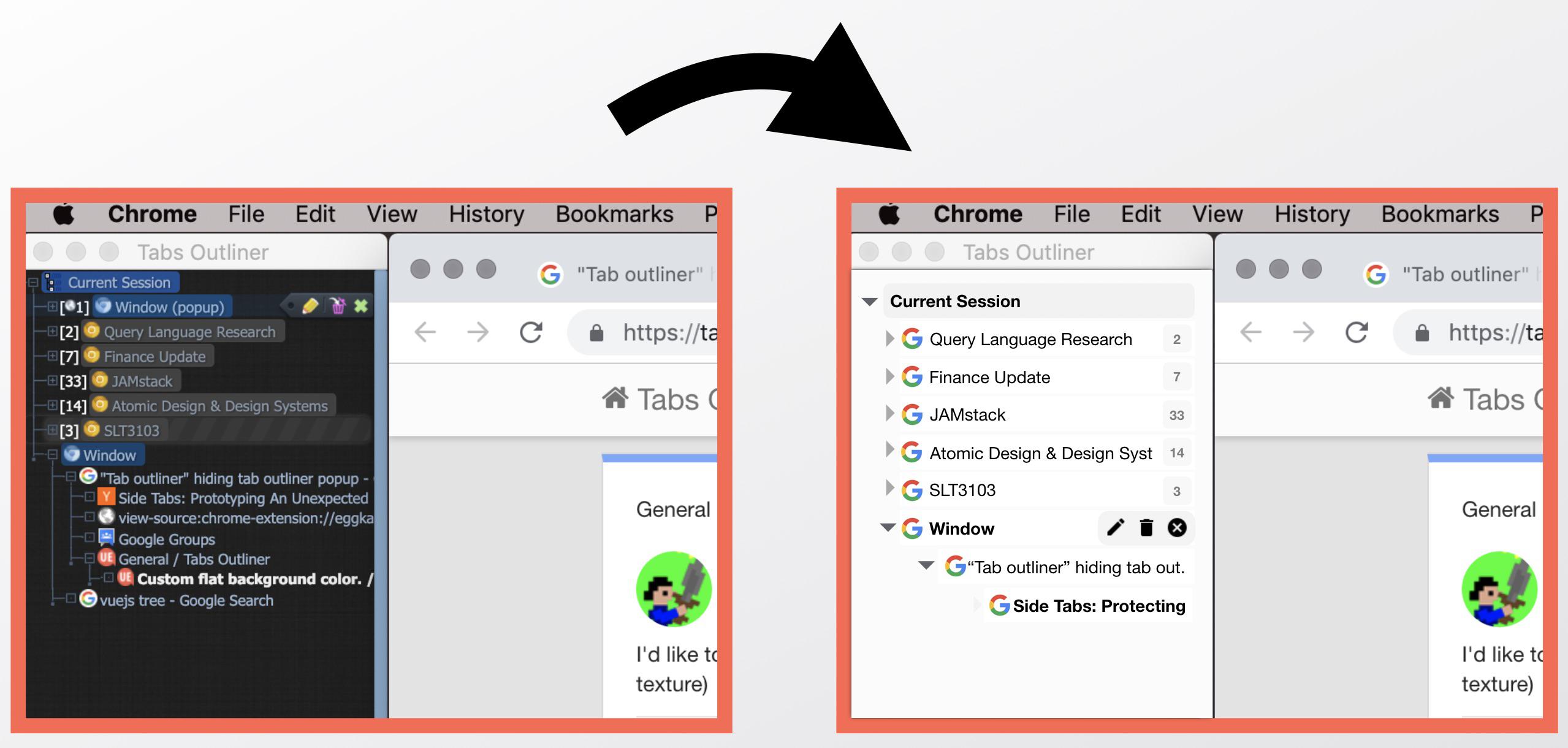
Since this is a Chrome extension, it would be great if it blended in better with Chrome by following more of Google's Material Design - colors, icons, etc - and for the UI elements to "blend in" so that the actual content, the tab names & icons could stand out more.
Here are some more specific UI suggestions:
1) Use colors & icons that fit with Material Design, so it fits in with the rest of Chrome. The current theme screams “gamer" :)
2) It'd look nicer if the tab-qty-# was de-emphasized a lot and the titles were left-aligned instead of flowing after the tab-qty-#, perhaps putting the tab-qty-# after the title (see screenshot).
3) Perhaps hide the window scroll indicator if not needed.
4) Perhaps just use bolding of text to show active mode.
If it was possible to contribute themes, I'm sure someone would.
I’ve attached an example mockup.
Customer support service by UserEcho


See also https://tabsoutliner.userecho.com/communities/1/topics/74-update-iconography-and-ui#