- General
-
 Questions

+1
Declined
Have you considered increasing the default transparency of the bottom left UI?
In the "new user" scenario, had I not read the docs, I might not of know the bottom left UI was there.
I have an ATI card, attached is a screenshot for what its worth. I do use a program call F.lux that automatically adjusts my monitors to be kind on my eyes, based on time of day. I disabled this and still feel the default setting is too hard to make out?
Without something behind
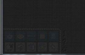
With something behind, I totally missed it when I first loaded the extension.
Answer

Would it be worthwhile making it more noticeable? Most 'web apps' tend to have a fixed bottom bar that is consistently easy to find. I don't think transparency enhances the experience at all. Also, transparency fading obviously is not as lean (CPU friendly) as something without animation. You could also re-consider placement. Dragging up is harder than dragging down or right. An opaque fixed left vertical bar might make more sense and take up less space!

Next version will have a possibility to connect an external css themes. This will give possibility to experiment with different placements and so on.
Really left positioned vertical toolbar is an interesting idea. .
Really left positioned vertical toolbar is an interesting idea. .

Please no! Horizontal screen space is already limited. We don't need yet another left-side vertical element. I think removing the transparency would be just fine. I see no disadvantages, as I really wouldn't miss seeing 10% less of the entire tree.
Customer support service by UserEcho


Looks perfectly unnoticeable, as intended.