- General
-
 Ideas
Ideas

0
UI improvement Mockup
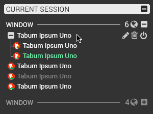
Thanks for maintaining this extension, wish it worked in firefox as well, anyhow, without further ado, I made a quick mockup off the top of my head for streamlining the UI and improving legibility. Something better could be made after gathering all the user feedback, and I'd be willing to make such a mockup if you are interested. I did not change anything but the style of things as they are. The only thing I changed is instead of x, i threw in a power button because I thought that offers a better contrast of meaning to 'trash' and is more representative of shutting down a tab without getting rid of it. The font is Roboto, because that is built for legibility at small sizes. It's a very Ubuntu design at the moment, it just happened that way, I didn't think much, I just scribbled it on the fly. Let me know what you think.
The aim was to reduce wasted space and visual clutter on the left side by getting rid of one two iniitial indentations and moving the the plus/minus square into the favico visible only on hover. The rest focused on a legible font and clean auxiliary imagery such as icons
Customer support service by UserEcho


I'm not sure the thicker font would be an improvement for me. A high percentage of my nodes intentionally have long descriptions. A thicker font would likely mean less node text is displayed and I would be seeing less information (undesirable).
Also, truth be told, I think Vladyslav's limited development time is best spent in other areas. I sure wish this was a cooperative project on GitHub! Then anyone could work on the part of Tabs Outliner they were motivated to work on.
I do think I might like your color choices (seems easier on my eyes) more than the current ones.
Ideally all fonts and colors would be user-configurable.