
+2
Wird überprüft
A smaller drag-image would make rearranging easier
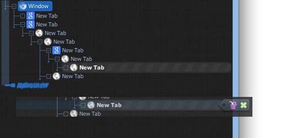
Currently, when you drag something, the image that follows the mouse is essentially a screenshot of every line you're moving, PLUS the half-lines before and after it. This is very very bulky, and makes it hard to see what's under the mouse.
I think instead of having a screenshot-image following the mouse, it would be better if it just showed the icon/name of the root of what's being dragged, OR just highlighted the area that's being dragged and had no drag-image at all (possible with a mouse icon change while dragging).
I think the indicator line showing where the drag will land is perfect. Keep that.
This is what it looks like when you drag a list:
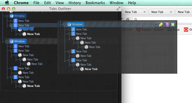
This shows how cluttered it gets when you try to, for example, drop it on one of the hanging-dots in another tree. I can't see where it's going to land at all.
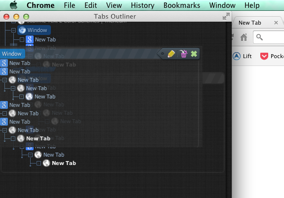
And this shows how much extra space is included when only dragging one node. Notice how nearly all of the next line, and half of the previous line are included in the image despite not being in the dragged object.
I think instead of having a screenshot-image following the mouse, it would be better if it just showed the icon/name of the root of what's being dragged, OR just highlighted the area that's being dragged and had no drag-image at all (possible with a mouse icon change while dragging).
I think the indicator line showing where the drag will land is perfect. Keep that.
This is what it looks like when you drag a list:

This shows how cluttered it gets when you try to, for example, drop it on one of the hanging-dots in another tree. I can't see where it's going to land at all.

And this shows how much extra space is included when only dragging one node. Notice how nearly all of the next line, and half of the previous line are included in the image despite not being in the dragged object.

Antwort

Antwort
Wird überprüft
You right, but this image is actually rendered not by extension but by Chrome implementation of the HTML5 drag & drop. And it was better a few Chrome versions ago...
The fix is possible through... but, it's not a something very urgent, and really require a lot of work to replace this default and automatic behavior.
The fix is possible through... but, it's not a something very urgent, and really require a lot of work to replace this default and automatic behavior.

I also had this problem on my first run with TO. When and if possible, showing a group being dragged via title and total tab count ("Window - test stuff (23)") would be much better.
Perhaps it's better to use an 'on-mouse-drag-start' event to replace the visual somehow?
Perhaps it's better to use an 'on-mouse-drag-start' event to replace the visual somehow?
Customer support service by UserEcho


The fix is possible through... but, it's not a something very urgent, and really require a lot of work to replace this default and automatic behavior.